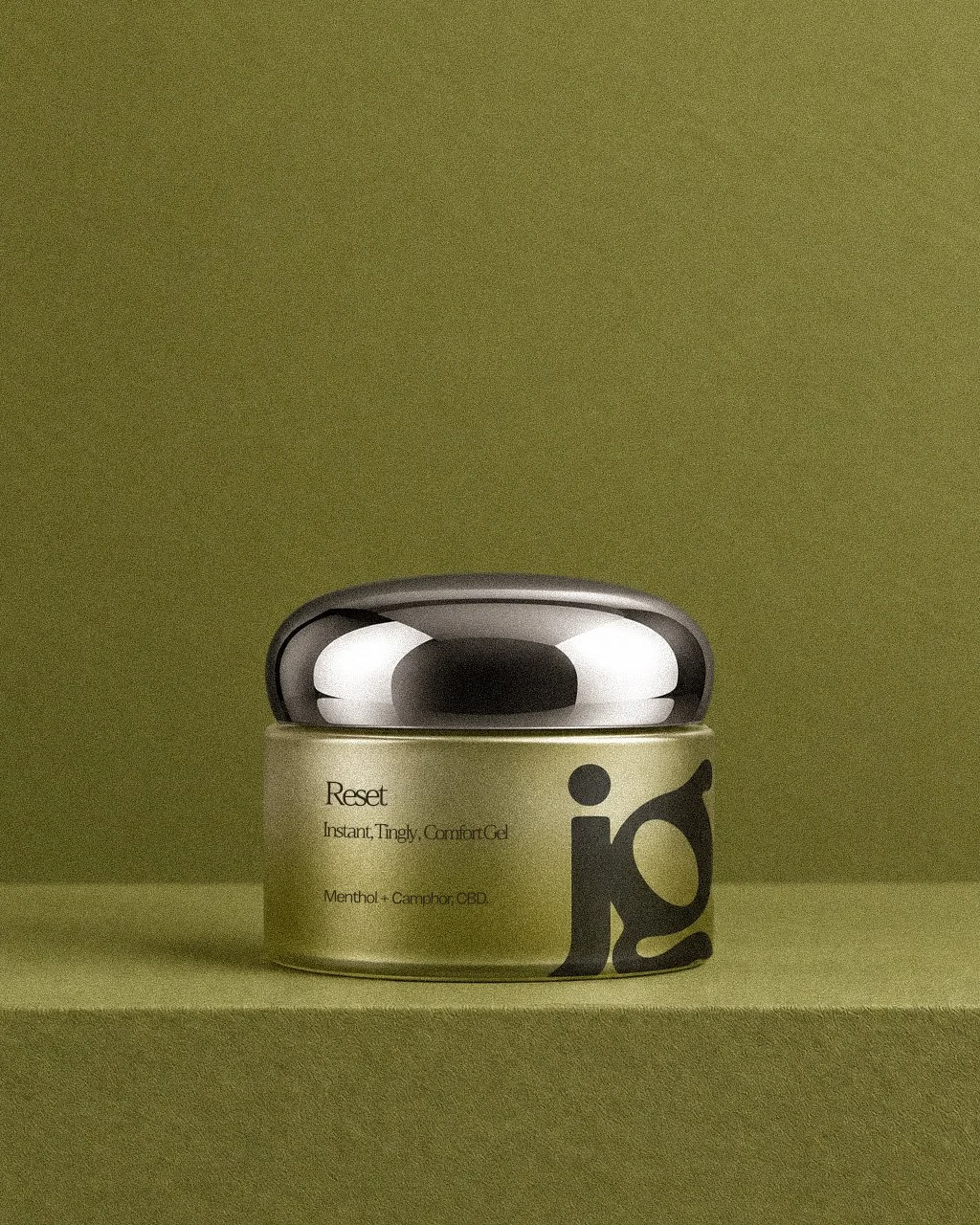
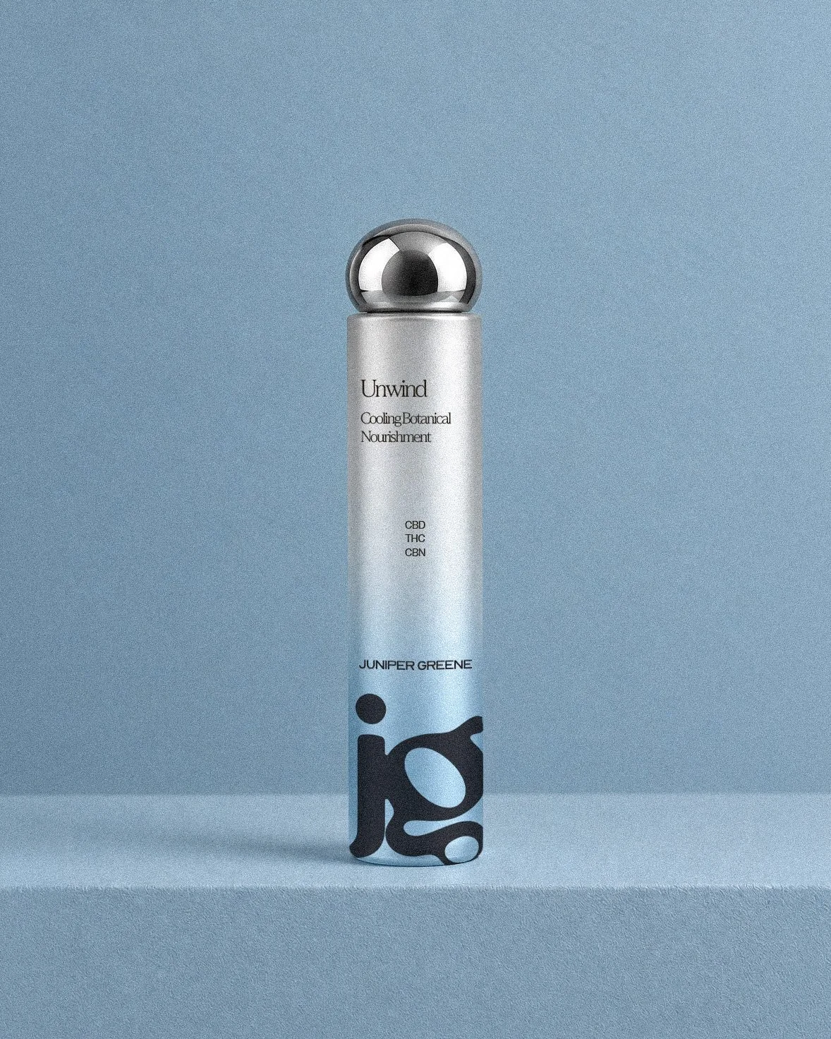
Juniper Greene
Branding & Identity | Design | Art Direction | Product Design
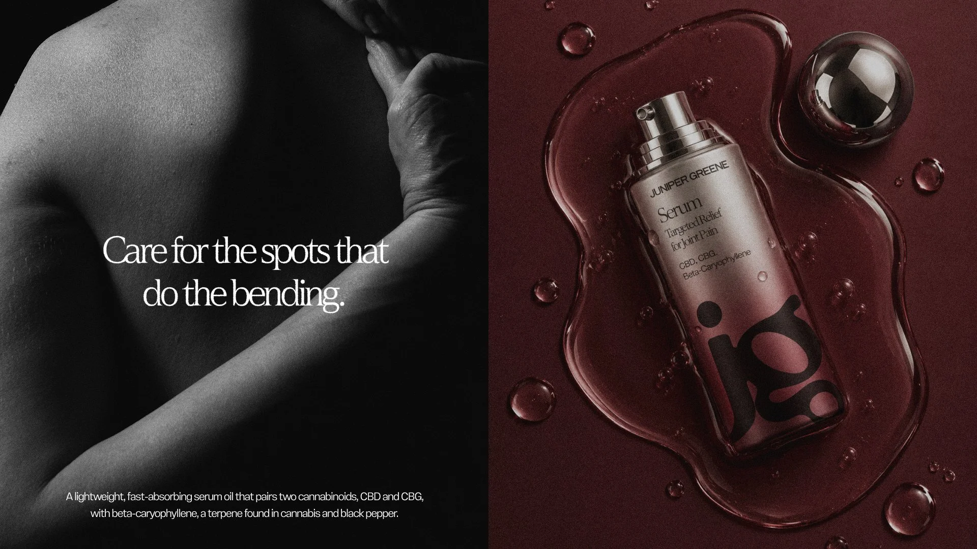
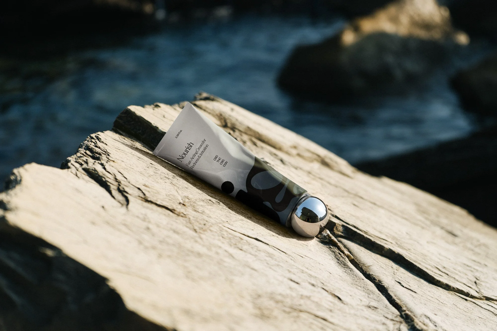
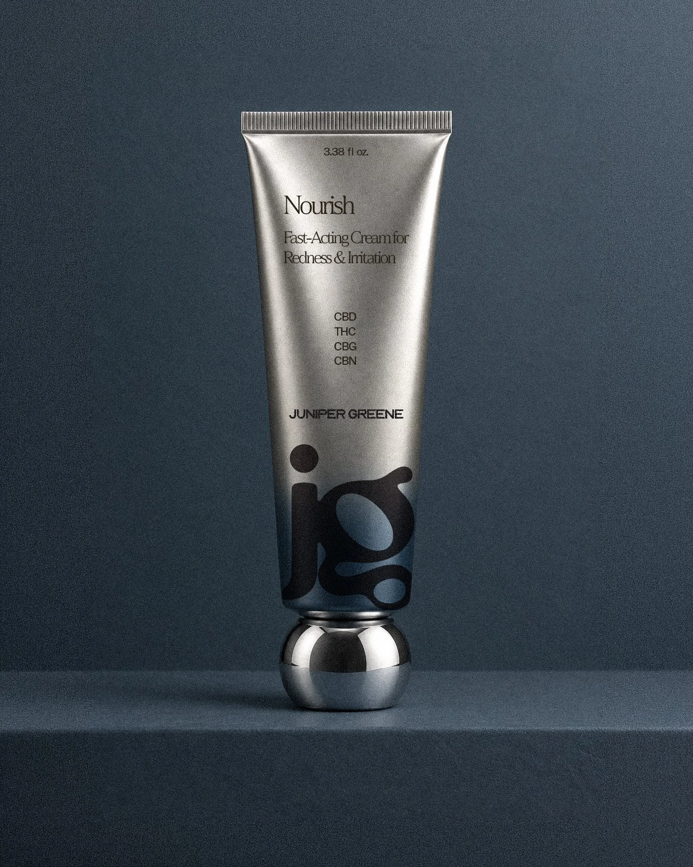
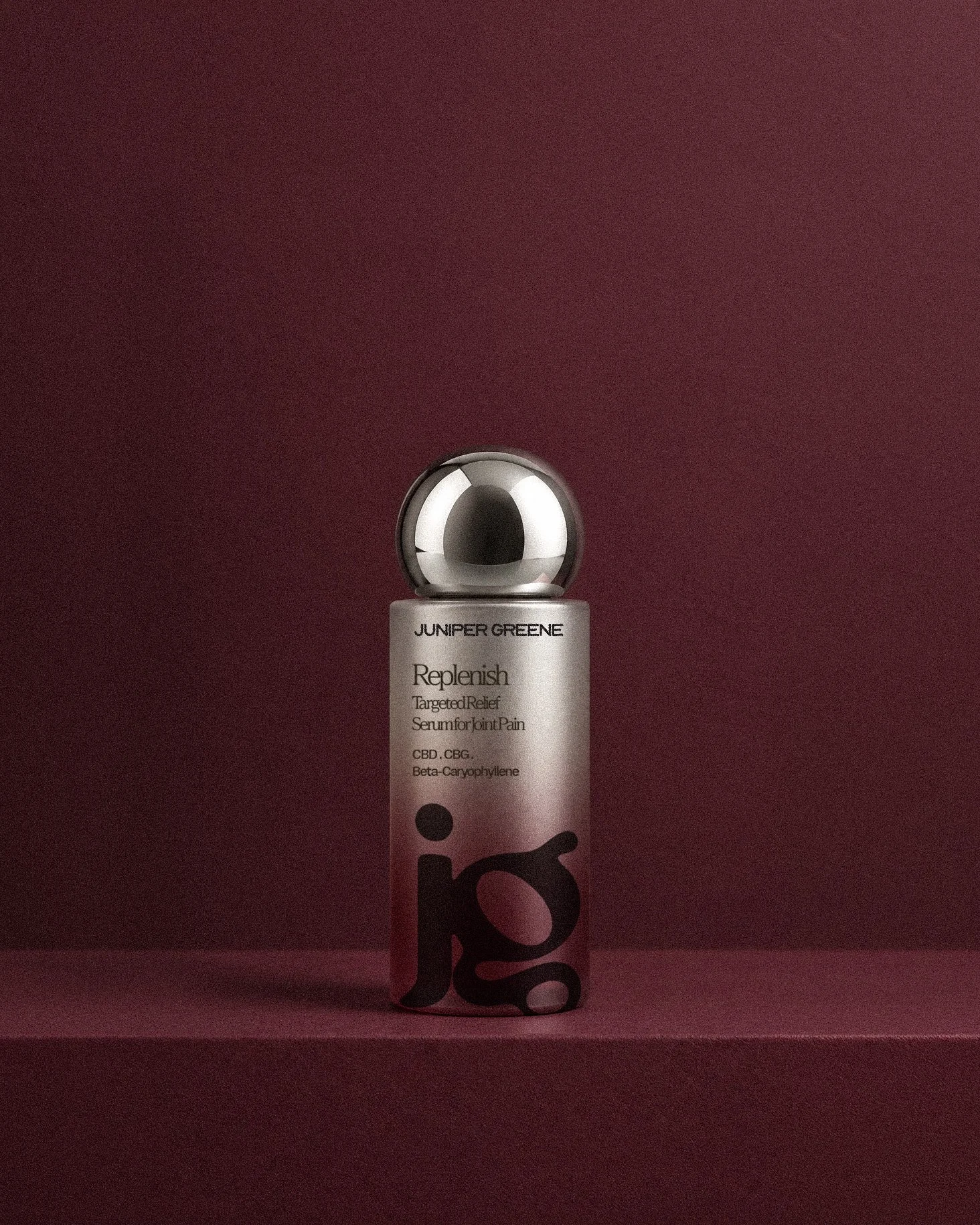
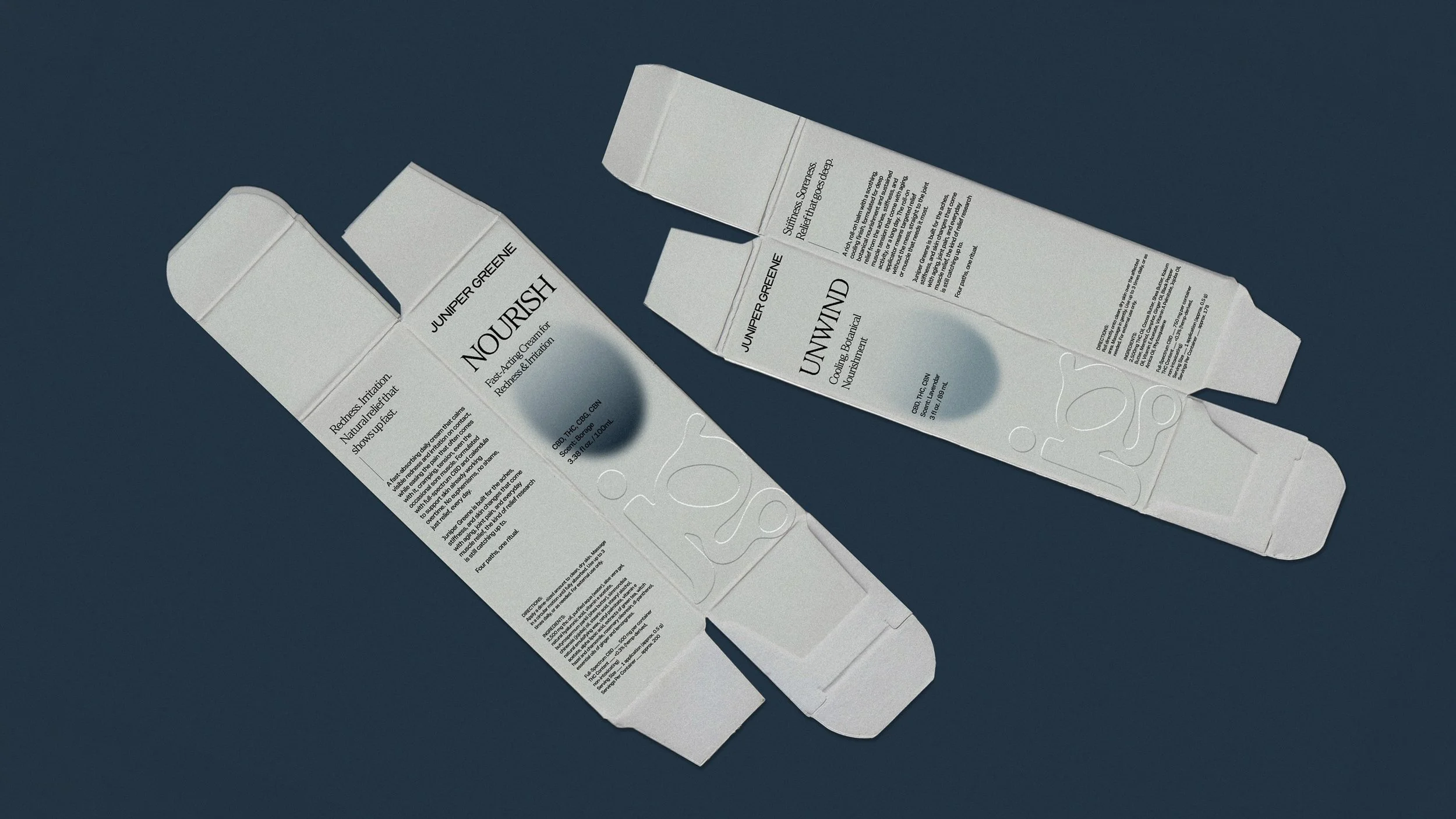
Juniper Greene is a CBD skincare start-up with a formula built around targeted pain relief, joint pain, redness, cramping, sore muscles, the everyday aches most people just learn to live with. Using CBD, THC, CBG, and CBN, cannabinoids with real research behind them as pain relievers, though one of them still carries a stigma most brands are afraid to touch head-on. My role as art director and designer was to take that product and turn it into a brand: strategy, positioning, visual identity, and packaging built from the ground up.
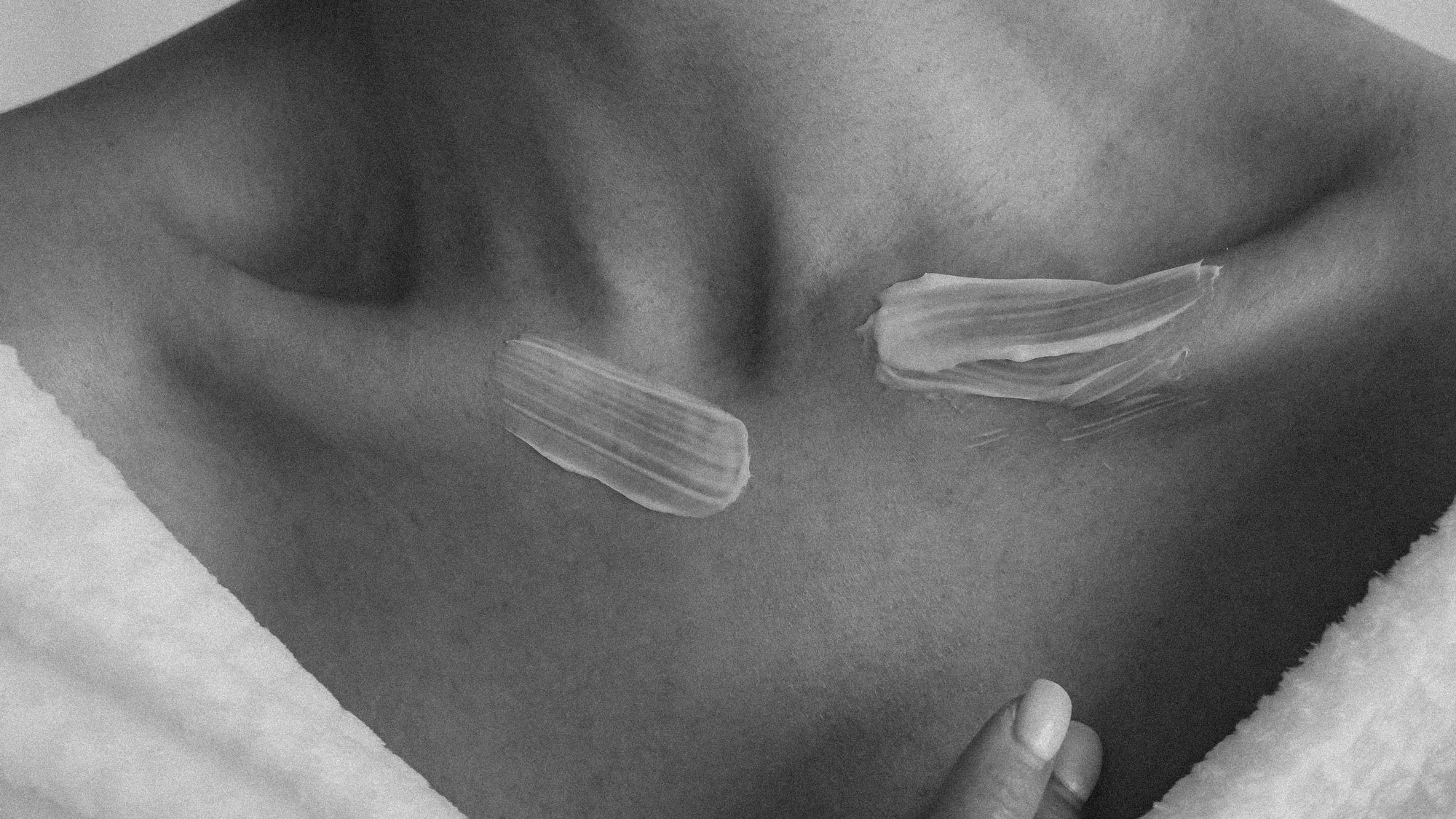


Most cannabinoid skincare falls into one of two traps. It looks so clinical it feels cold and sterile, clearly medicine, or it leans so hard into wellness culture that it stops feeling credible. Neither is something you'd want sitting out on your vanity. The brand needed to be both at once: legitimate enough to trust, beautiful enough to display.

Brand Strategy
Clinical, not clinical-looking
The formula does the medicinal work so the brand doesn't have to look medicinal. Credibility comes through craft and restraint, not lab-coat visual cues.
Relief without stigma
CBD, THC, CBG, and CBN are spoken about plainly and confidently, as functional ingredients with a job to do. Topical THC doesn't cross into the bloodstream, so it won't get you high. That fact removes the stigma, not euphemism.
Natural first, never naive
Botanical warmth balanced with real efficacy claims; the brand trusts its customer to want both nature and results, not one traded for the other.
Built for the gap, not just the moment
Formulated around a life stage the clinical world hasn't caught up to yet — while staying just as useful for cramps, workouts, and everyday redness, so the brand never reads as a single-issue medical product.